

Every year, the leading paint brands announce their ‘Color of the Year.’ The selections reflect either current or future trends in home design. We’re highlighting a few paint colors and color palettes.
As you begin to think about your home remodeling plans for 2021, consider these 2021 Colors of the Year in your design. Check out 2020 colors HERE and 2019 colors HERE. I selected 2019 color of the year, Blueprint, for a powder room in my home and I absolutely love it! Let us know what you think of this year’s colors.
Benjamin Moore – Aegean Teal
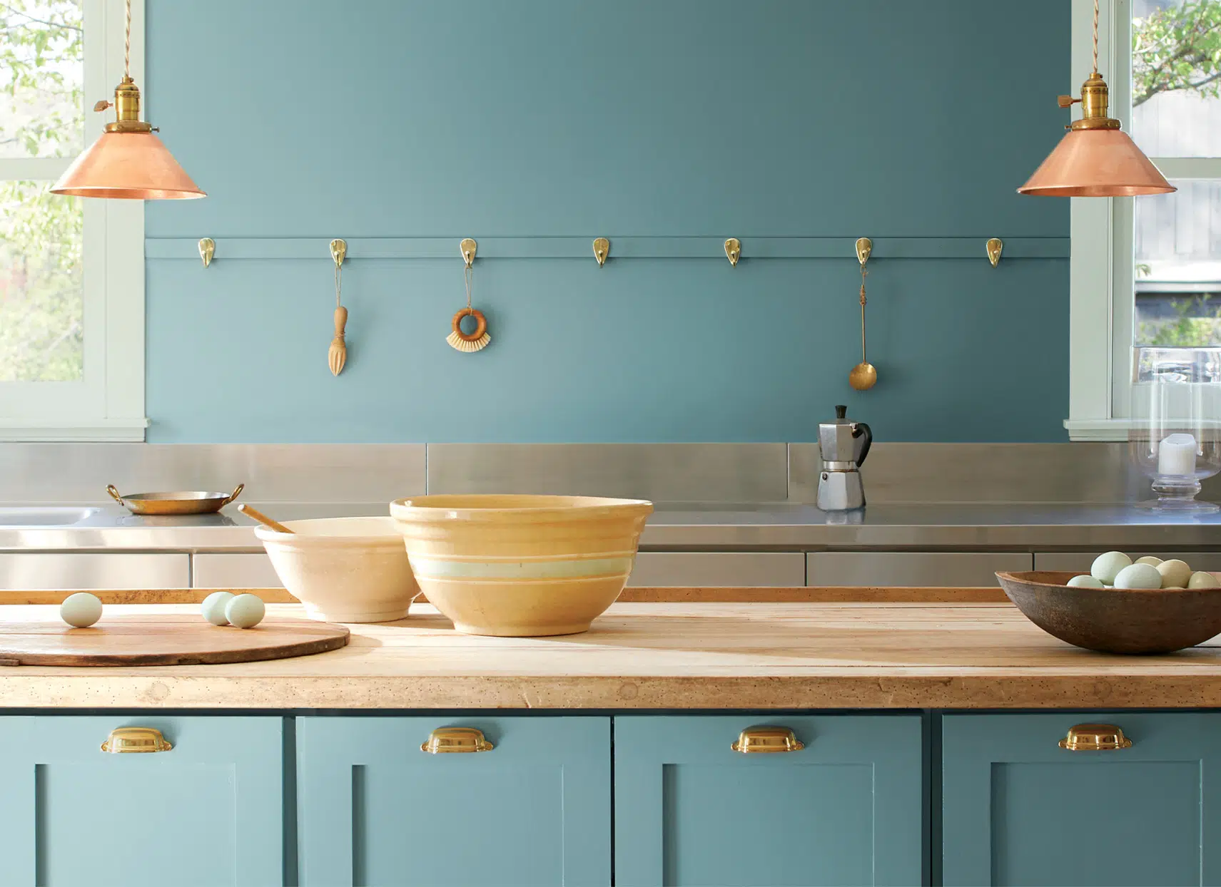
Benjamin Moore’s Color of the Year is Aegean Teal 2136-40. Aegean teal is a soft, tranquil blue-green. It is giving me major Mediterranean vibes — travel may be limited, but you can bring elements of your favorite places into your home!
Hannah Yeo, color marketing and development manager at Benjamin Moore, calls it “an intriguing blue-green that creates natural harmony and invites us to take a moment to reflect and reset.”
Benjamin Moore – Aegean Teal
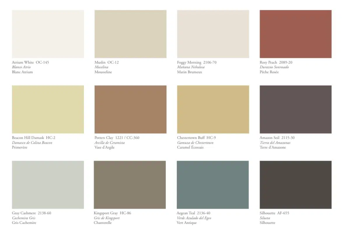
Benjamin Moore’s 2021 Color Trends Palette
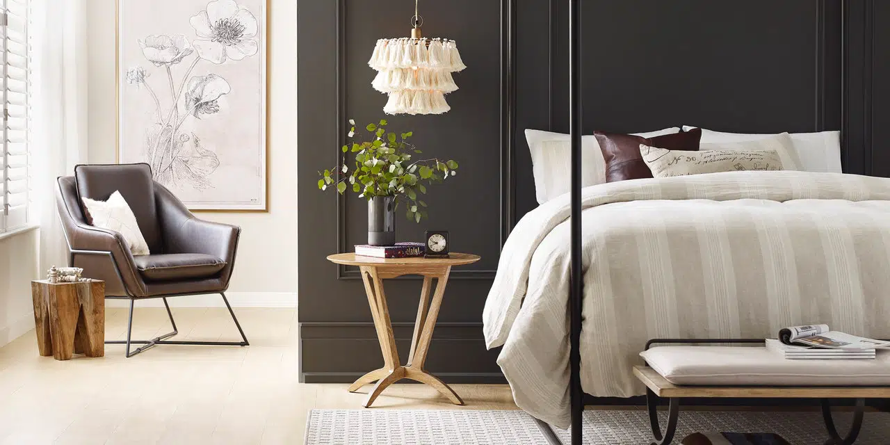
Sherwin-Williams – Urban Bronze
Sherwin-Williams Color of the Year is Urban Bronze SW 7048. Urban Bronze is shade of gray-brown that is a perfect balance of warm earthiness and bold sophistication.
″The home is now the ultimate retreat from the world, and color is an easy and effective way to create a personal haven,″ said Sue Wadden, director of color marketing at Sherwin-Williams. ″Urbane Bronze encourages you to create a sanctuary space for mindful reflection and renewal.”
Sherwin-Williams – Urban Bronze
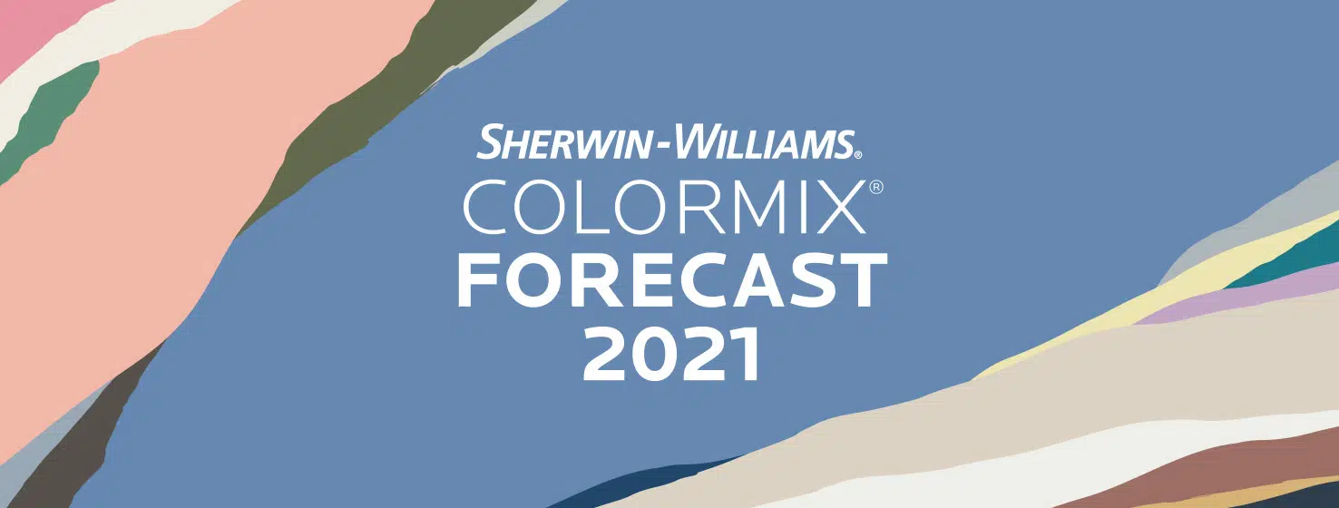
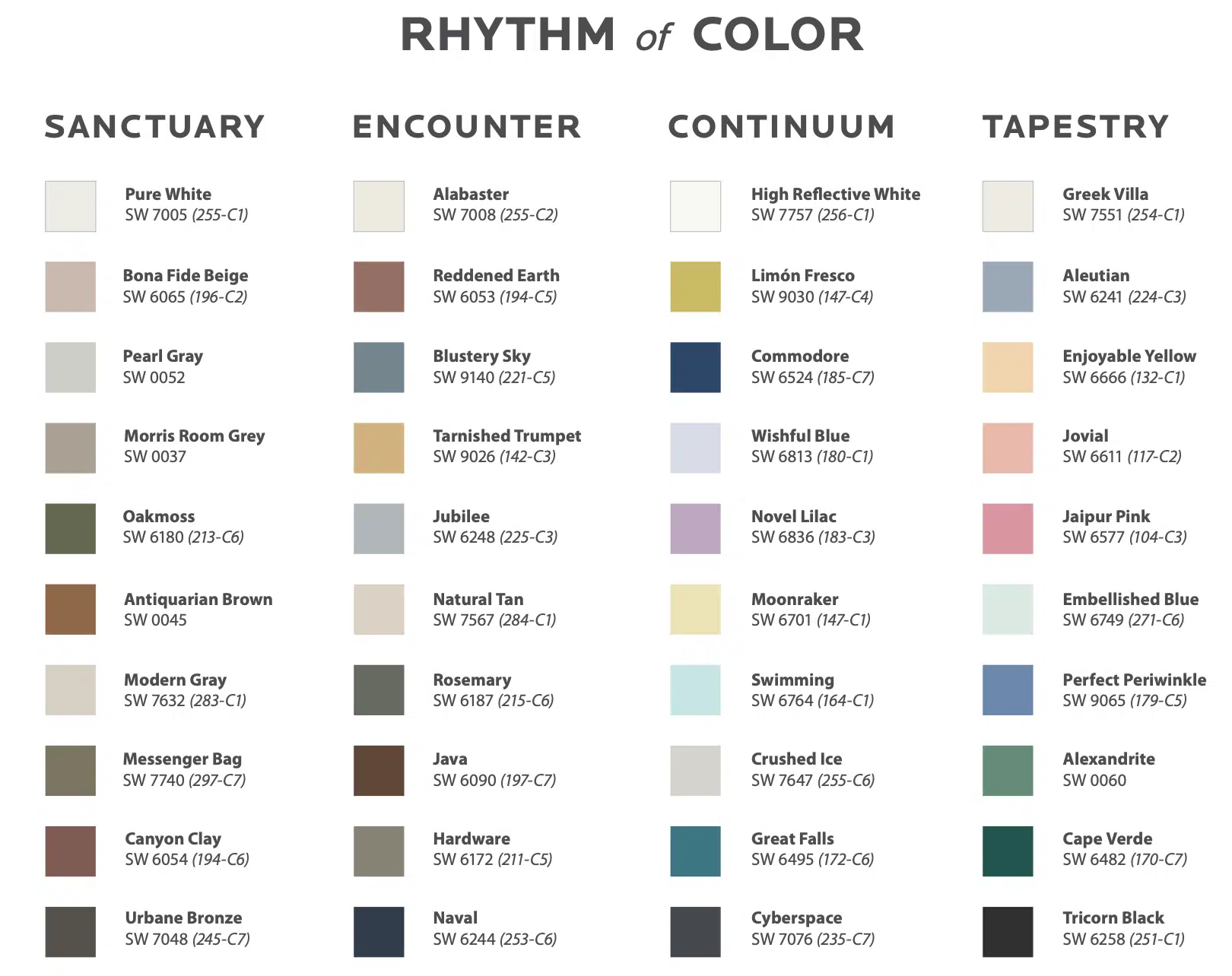
Sherwin-Williams ColorMix Forecast 2021
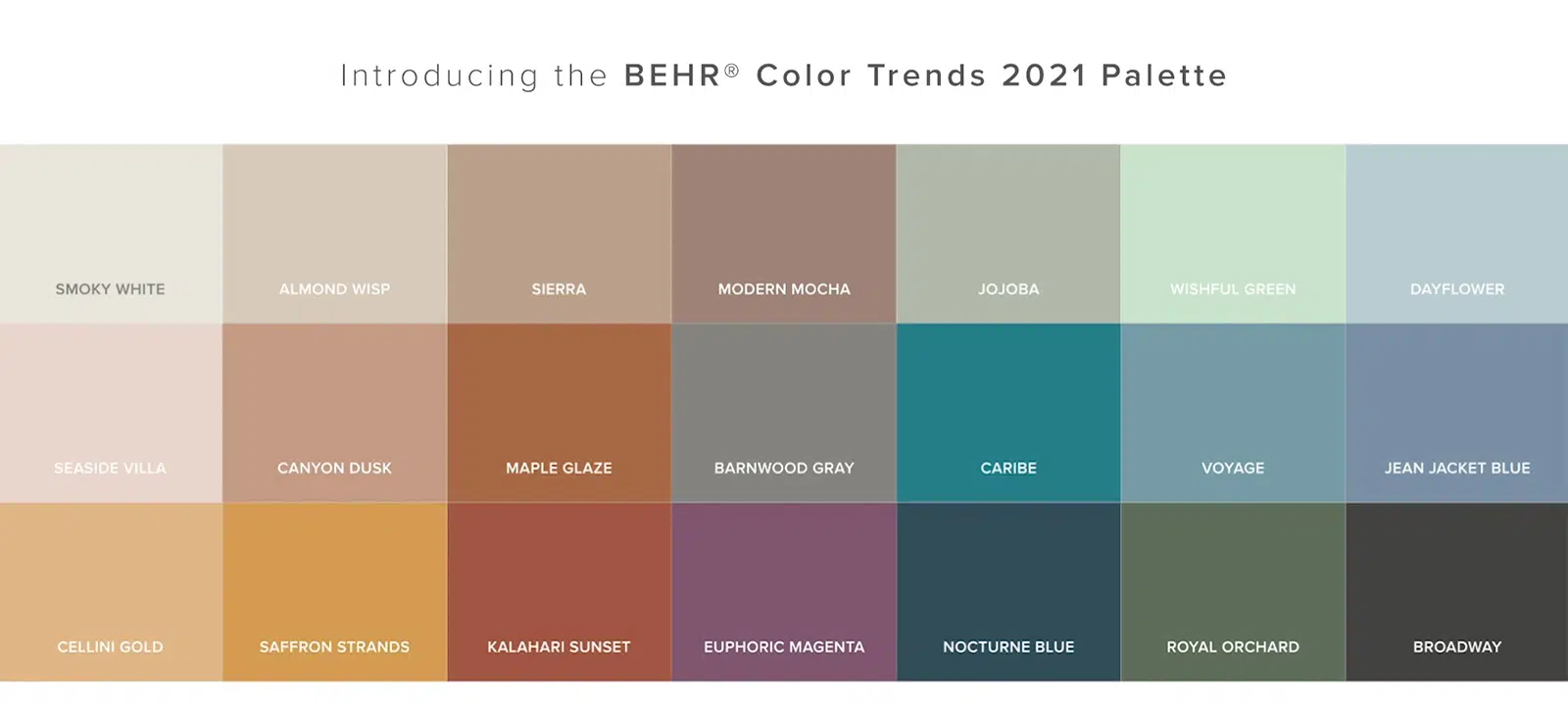
BEHR – Elevated Comfort
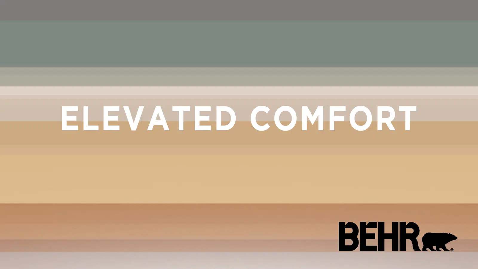
BEHR Paint Company didn’t select one paint color of the year, but rather an entire palette called Elevated Comfort. The BEHR Color Trends 2021 Palette is organized into six color themes: Casual Comfort, Subtle Focus, Optimistic View, Quiet Haven, Calm Zone and Outdoor Escape.
“This has been a year of unpredictability and 2020 has significantly changed our relationship with our home. When our color team began exploring a palette for the coming year, we knew it needed to be grounded in what we’ve been craving: comfort and personalization,” said Erika Woelfel, VP of color at Behr. “A new, ‘elevated’ articulation of ‘comfort’ goes beyond traditional beige, gray and green hues, and embraces color in a way that can redefine and enhance any type of space inside or outside the home.”
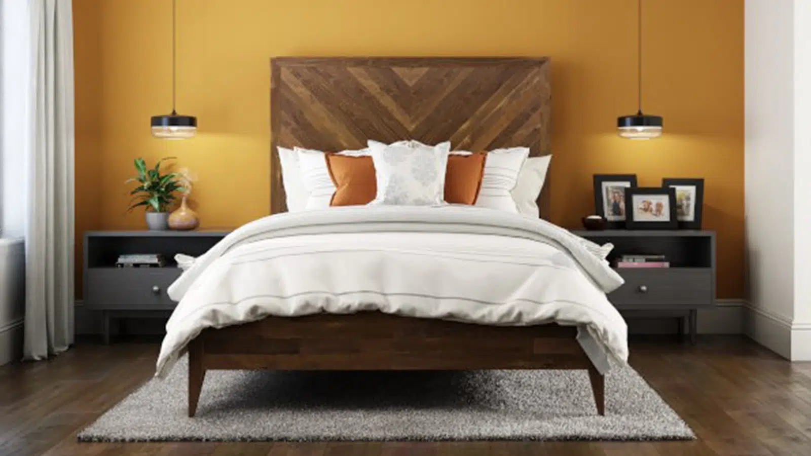
We featured Saffron Strands from BEHR’s Elevated Comfort Color Palette. It definitely exudes feelings of comfort — makes me want to cozy up by a fireplace with a cup of butternut squash soup.
BEHR 2021 Color Palette – Elevated Comfort
BEHR – Saffron Strands
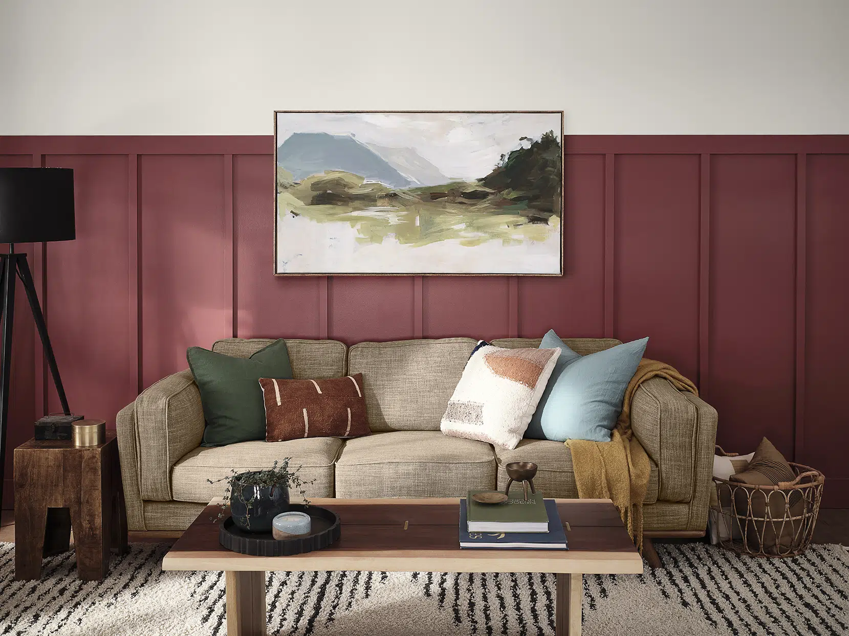
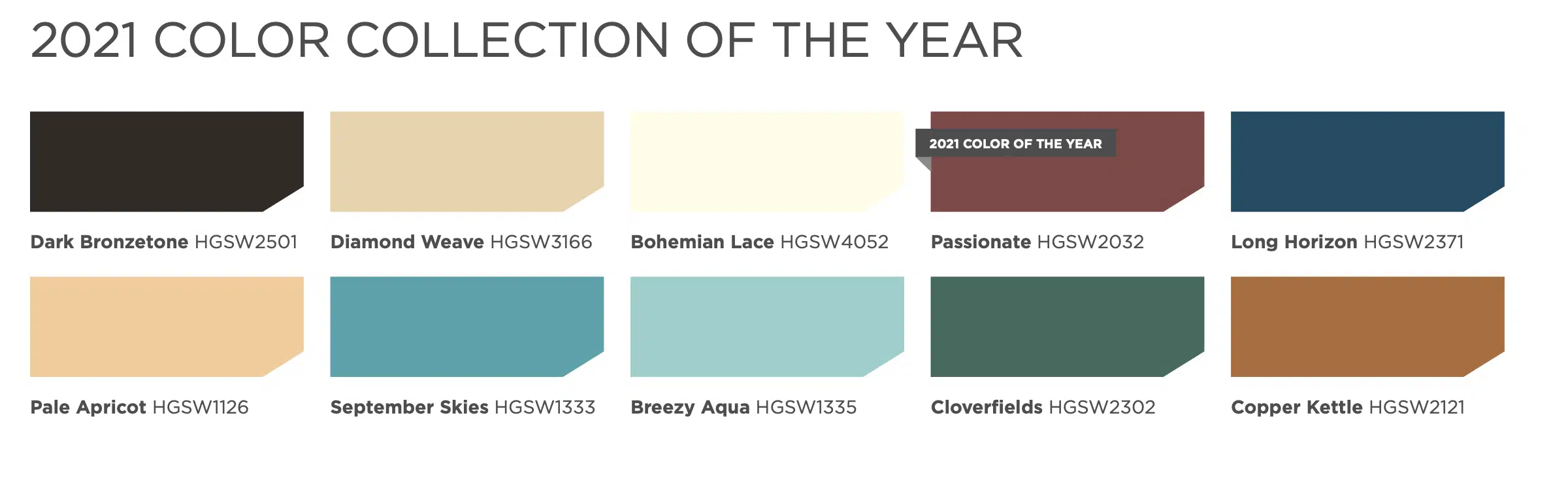
HGTV Home by Sherwin-Williams – Passionate
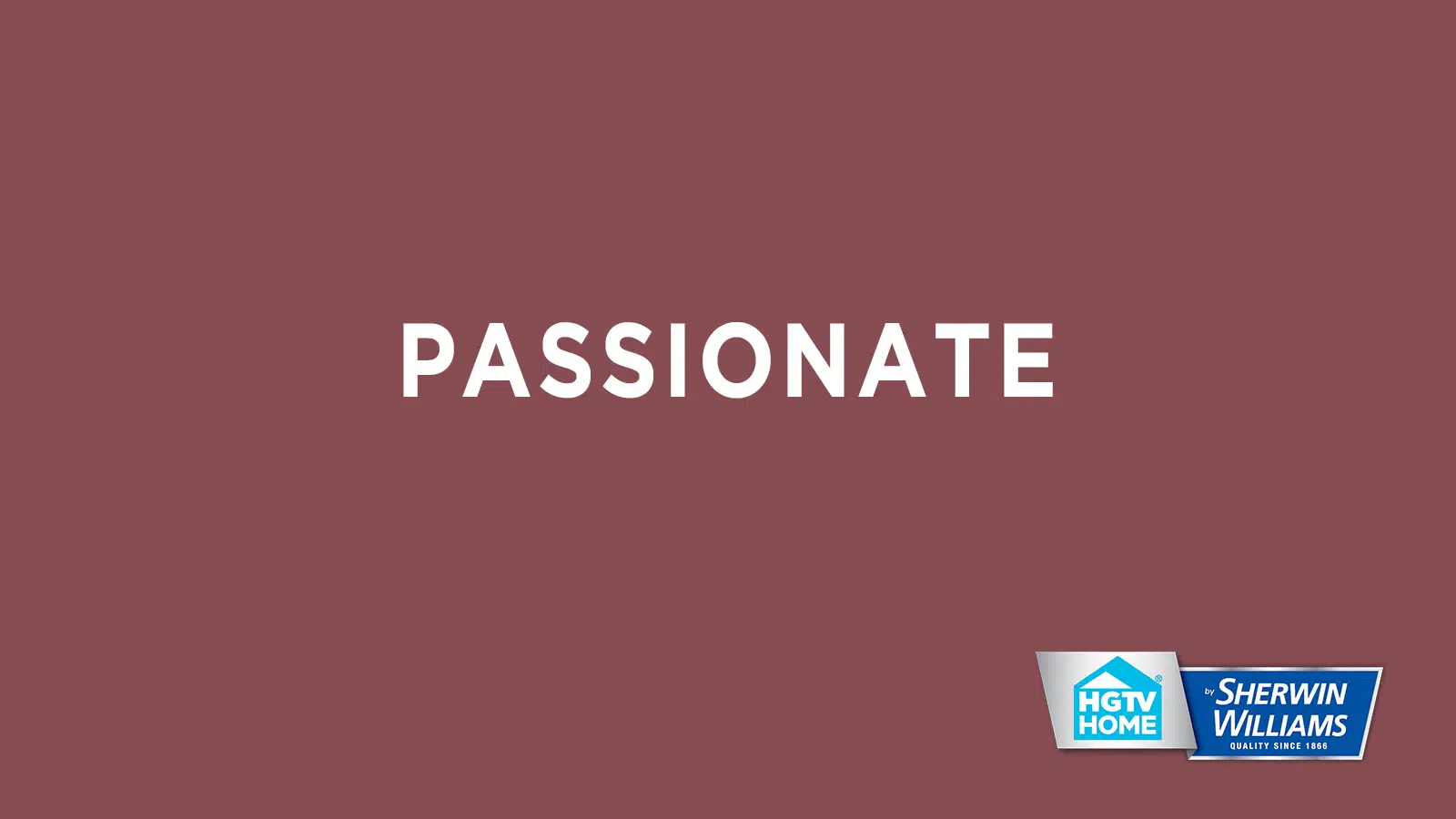
HGTV Home by Sherwin-Williams’ Color of the Year is Passionate HGSW2032. Passionate is a traditional, yet modern, rich berry hue. Passionate is part of HGTV Home by Sherwin-Williams color collection called Delightfully Daring – 10 shades, all inspired by nature.
“Consumers are eager to streamline and simplify their lives and homes, but that doesn’t mean we need to forgo having fun with color,” says Ashley Banbury, HGTV Home by Sherwin-Williams Senior Color Designer. “When used thoughtfully in design, color can be immersive and incite emotion. Whether it be monochromatic or colors with high contrast… color is now being used as the main accessory in a space to embody a sense of comfort and confidence.”
HGTV Home by Sherwin-Williams
HGTV Home by Sherwin-Williams – Delightfully Daring
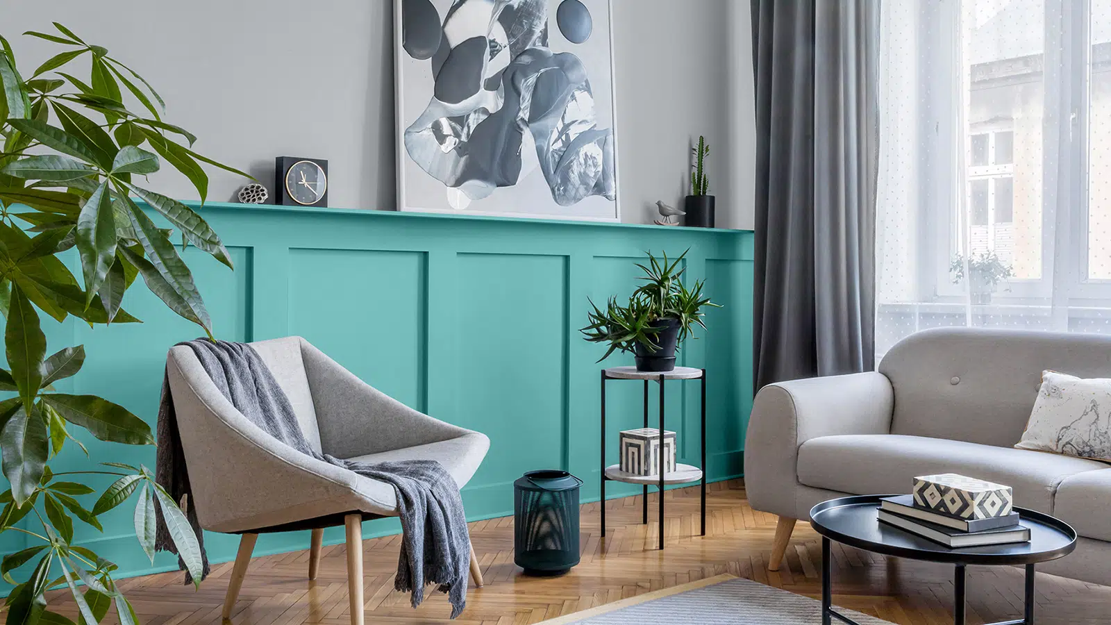
Glidden – Aqua Fiesta
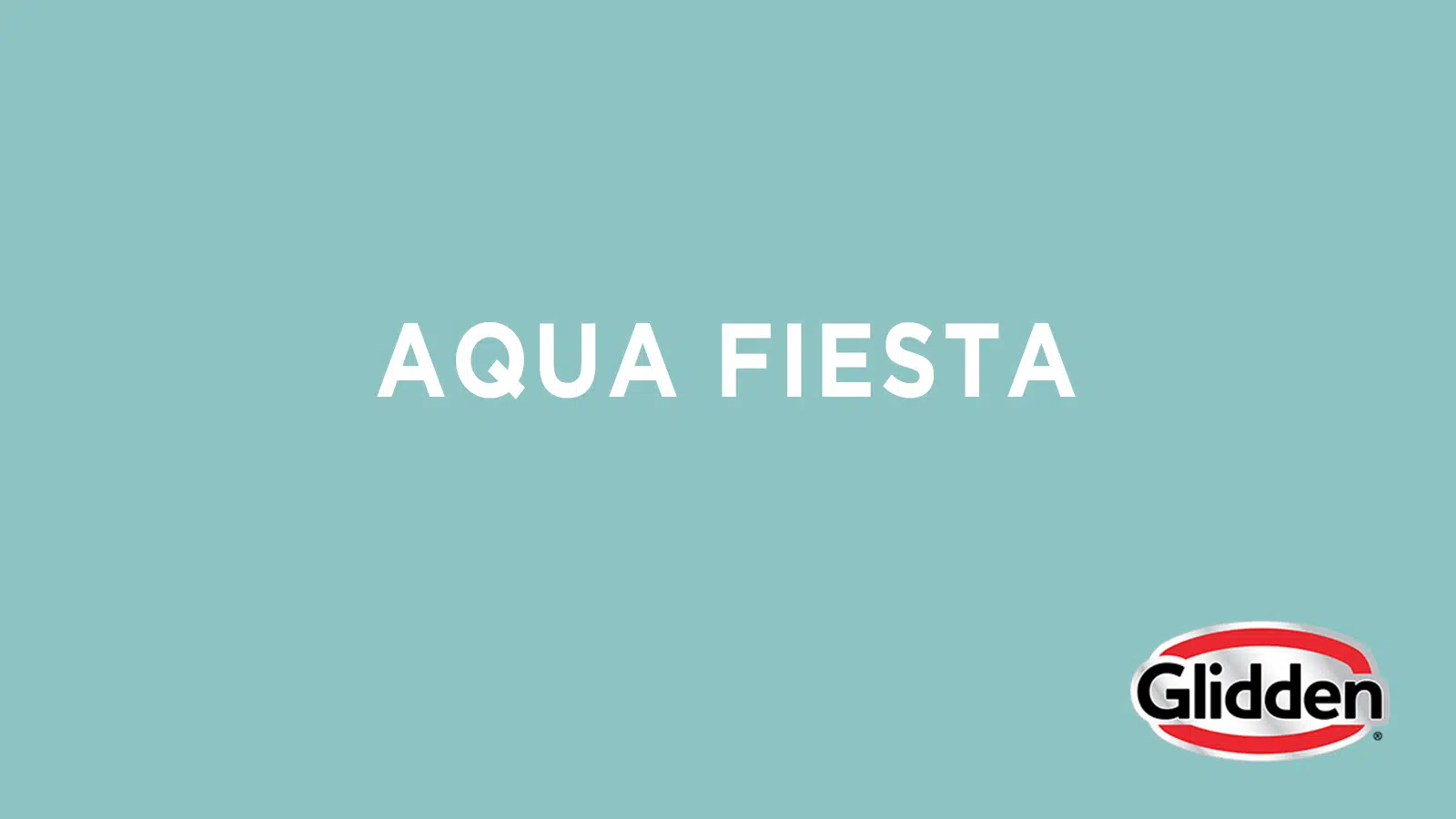
Glidden selected Aqua Fiesta PPG1147-4 as it’s Accent Color of the Year. Aqua Fiesta is a vibrant and cheerful blue-green shade that pairs nicely with Glidden’s Whirlwind – their 2020 featured color.
“No one could have predicted how upsetting 2020 would have turned out to be,” said Amy Donato, Glidden paint’s color whisperer. “Last year, we already knew that Whirlwind would be a staple color for 2020 and beyond, and the anxiety of this year has only made people crave this no-frills gray even more. We have gone one step further to help you stop procrastipainting by unveiling Aqua Fiesta as the go-to accent color. Now, it’s time to put down that homemade banana bread and pick up a paint brush.”
Glidden – Aqua Fiesta
Which featured color is your favorite? While painting is a good DIY project, it’s also nice to just have a professional take care of it! Contact Dale Gruber Construction for a quote on your painting project rachel@dalegruberconstruction.com or 320-251-4956.
